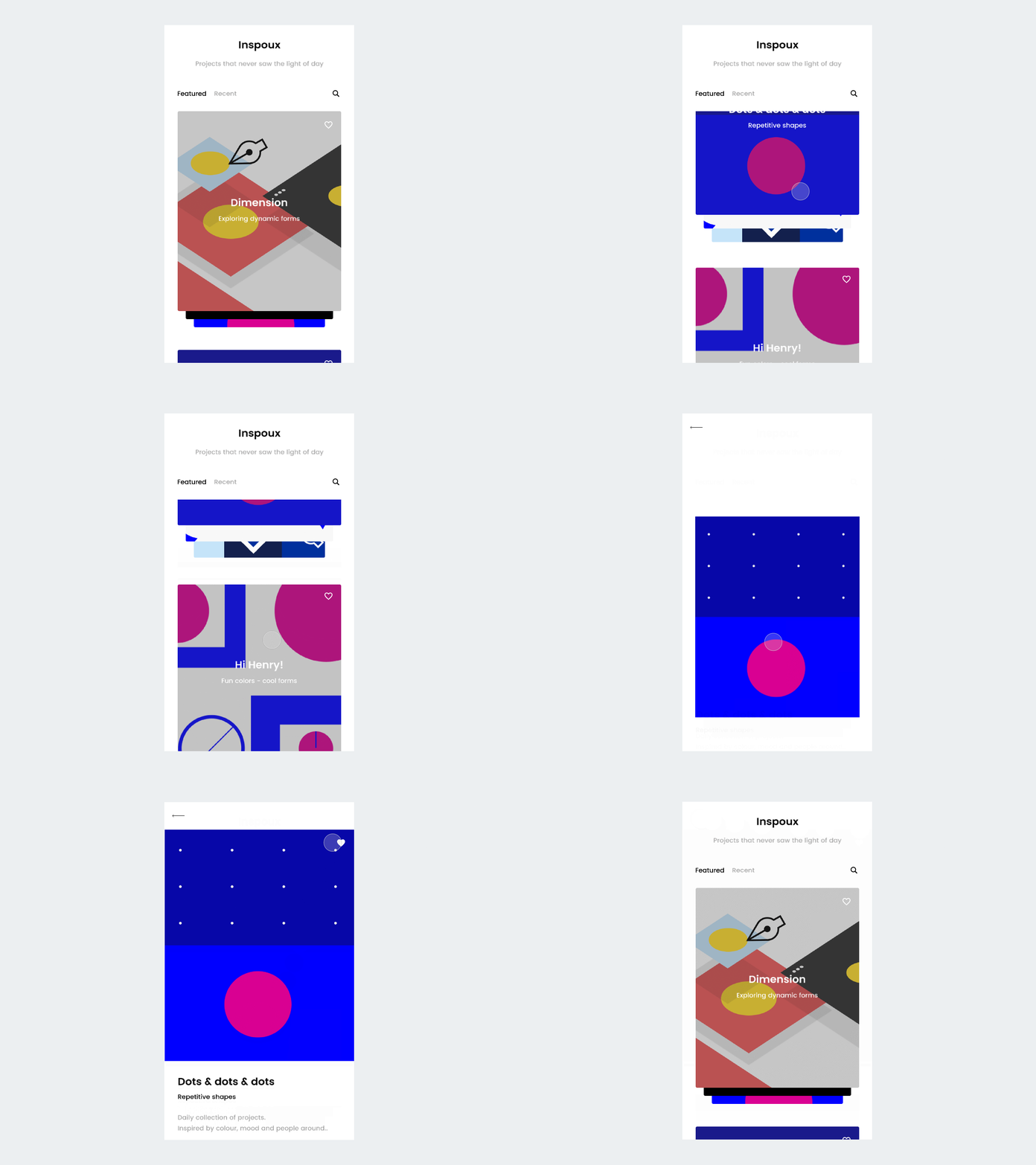
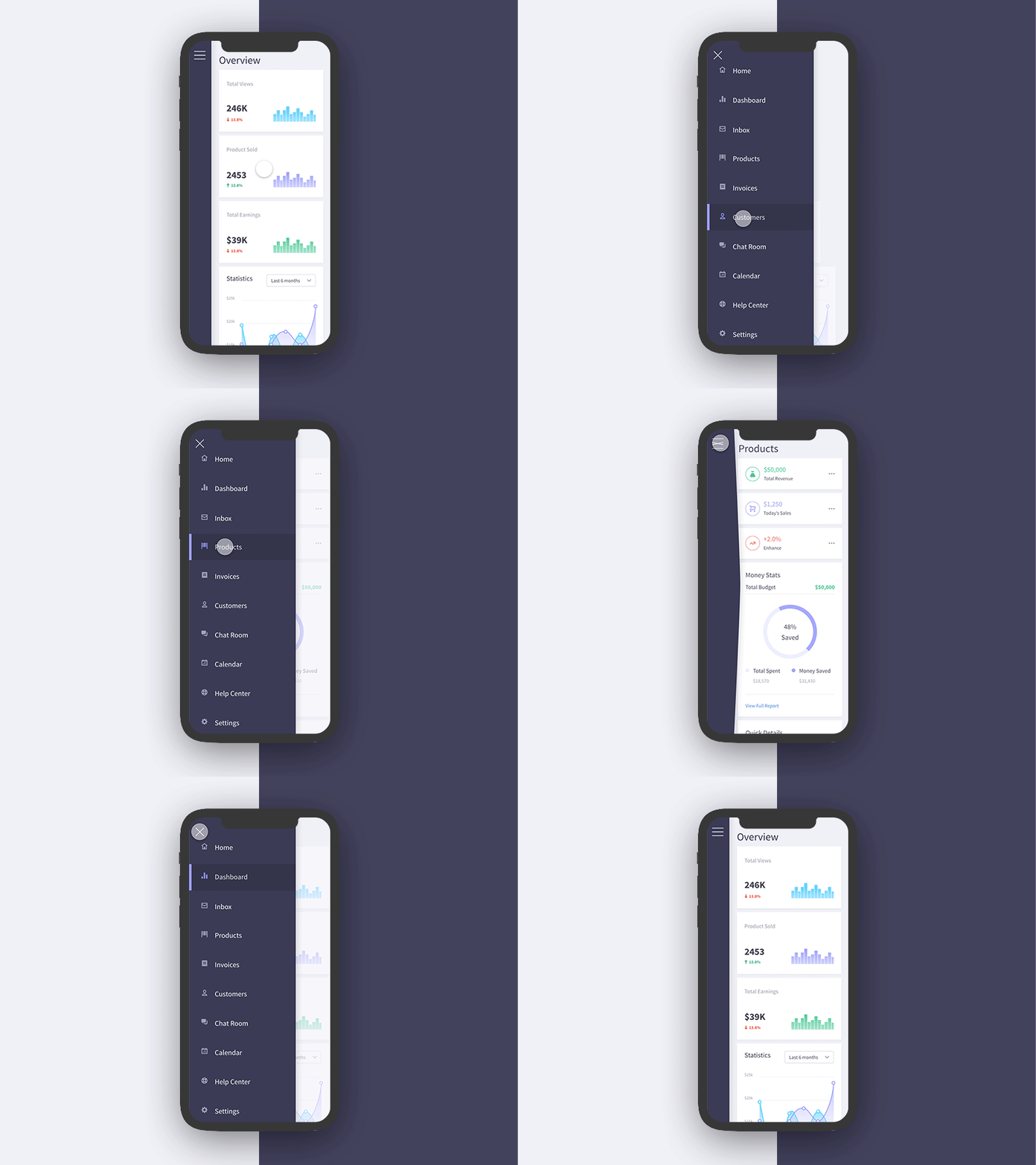
Two years ago, I had a class during my bachelor’s where we had an introduction to UX design with Adobe XD. I kept on playing with XD for a few more months for short-term, small projects. But then, I got the opportunity to test out Figma, and I made it my primary design tool in no time. I noticed this transition has been popular among designers for the past few years. There are lots of articles, videos, and posts debating which tool is better or which features are cooler. A few years ago, the differences between Figma and XD or Sketch or other similar tools were substantial (check out this blog post from 2019, or this video from 2018). But are those differences still relevant today?
As I’ve heard about the recent updates on XD, I did a bit of research and checked if Figma is still ahead in the game. Below, you will find an analysis of both tools. Because at Evozon we don’t use a specific tool, every UX designer can choose the one that works best for them. Which is cool! As I see it, the best tool is not the one that is considered as such by the community. It’s the one that resonates best with you, your work style, and your requirements. Thus, let’s see what Adobe XD has that Figma doesn’t, and vice-versa.
I got inspired by how Andy P. analyzed the 2 tools in 2018 in this piece, so the analysis will be a bit similar. But, all information is based on research and my experience with the tools. Thus, let’s see on what areas we’ll focus:
- Collaboration
- Constraints
- Components / Symbols
- Cost
- Plugins
- Prototyping
- Resource Management
Also, throughout the next paragraphs, I added relevant links in case you want to further check out the info. Let’s start!
Collaboration
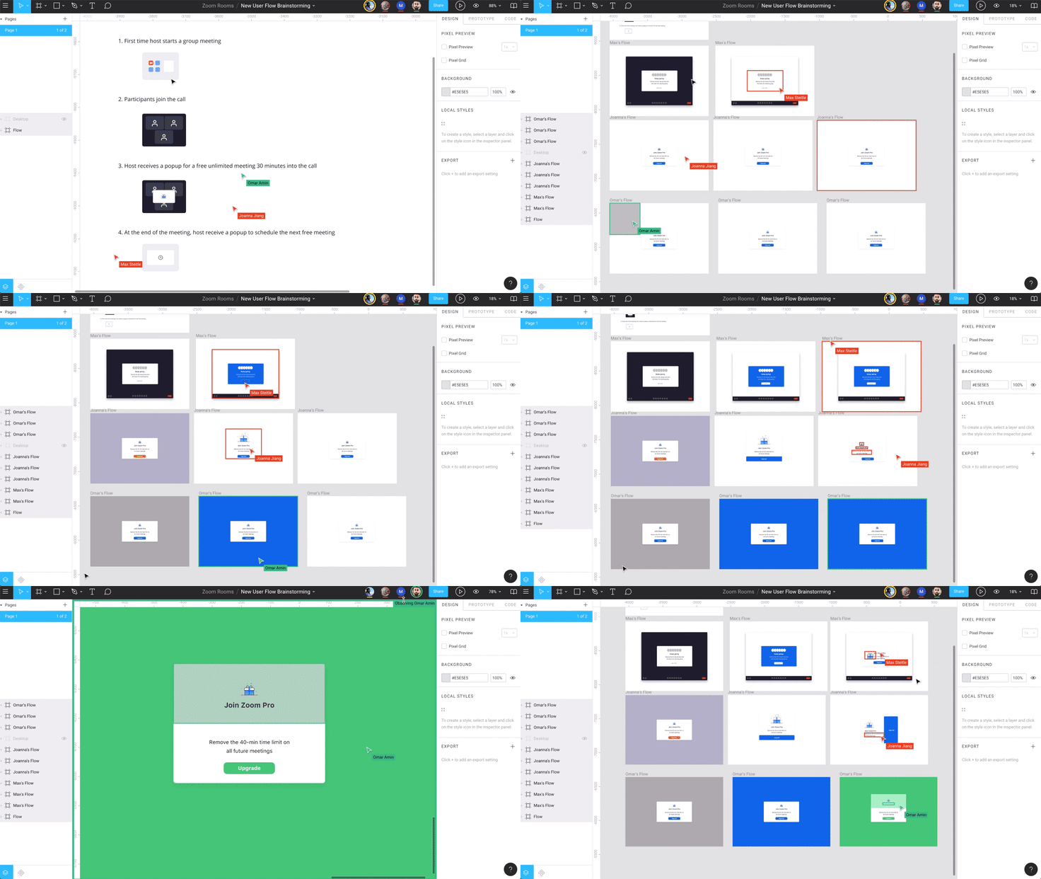
This has been one of Figma’s strengths since its launch. If you are a team player and your project requires collaboration between your colleagues, this tool is the Google Doc for designers. As Figma is a cloud app, you can simply run it on your browser. All your files live on the cloud. This means no more merging changes or transferring documents from one pc to another. You can co-edit, in real-time, one design file together with your teammates anytime and anywhere.
Recently, Adobe XD introduced the co-editing option for designers as well. I haven’t had the chance to test it out yet, but, according to them, you should have the same real-time collaboration experience. As long as your teammates work in Adobe’s Creative Cloud, the experience should be similar to the one Figma offers.
Constraints
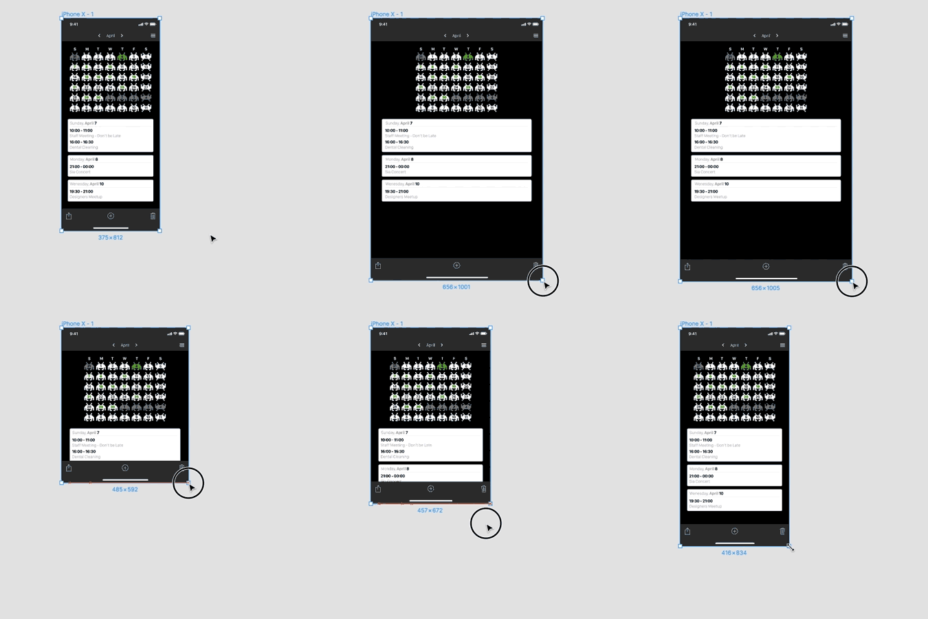
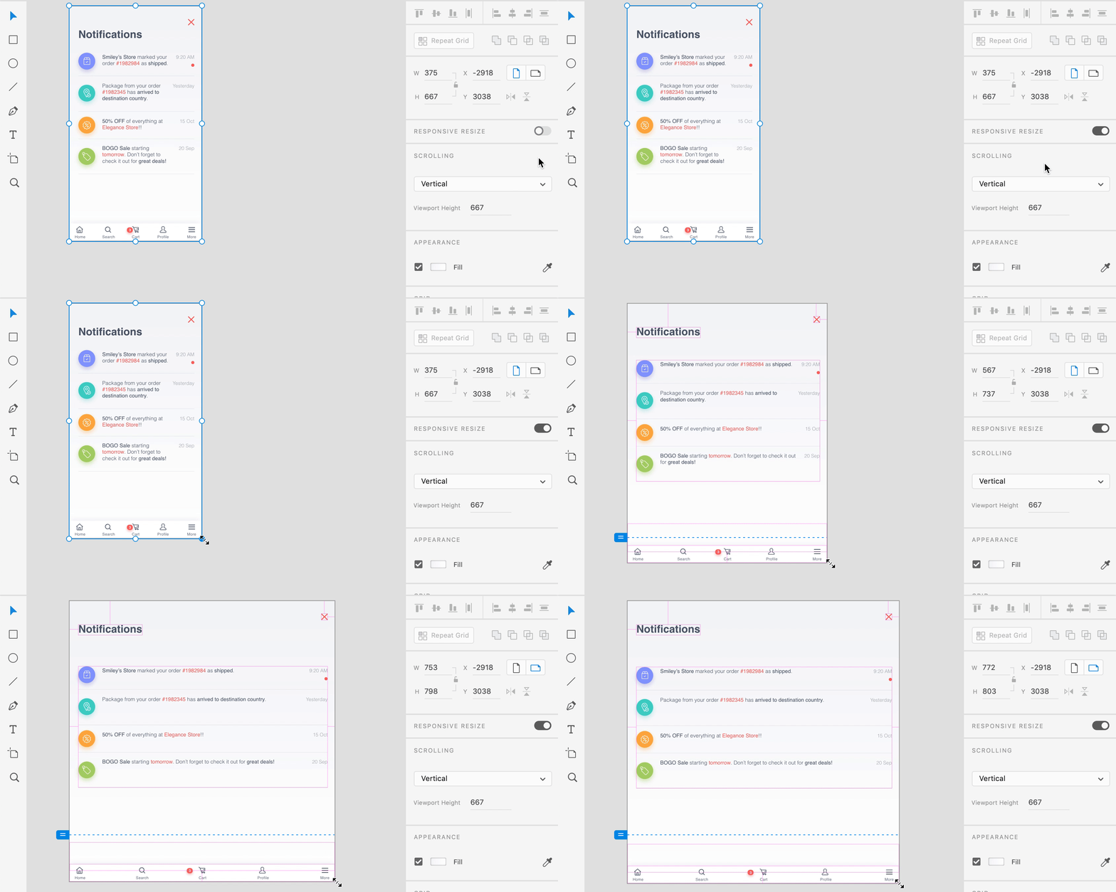
Your go-to feature for responsive screens. Through constraints, you can control how designs look on different screen sizes and devices. Wherever you set them up (left, right, up, down, center) you let the tool know which part of the object has to stay still when changes are made.
Both tools are great at this:
- Figma lets you scale an object through constraints. Thus, you can fix an object’s size and position as a percentage. For example, if an element takes 50% of a screen, when there are changes in the screen, the element will stay at 50%.
- XD can predict the constraints you are about to add to your object. It automatically applies them to you. This can be a real time saver.
Components
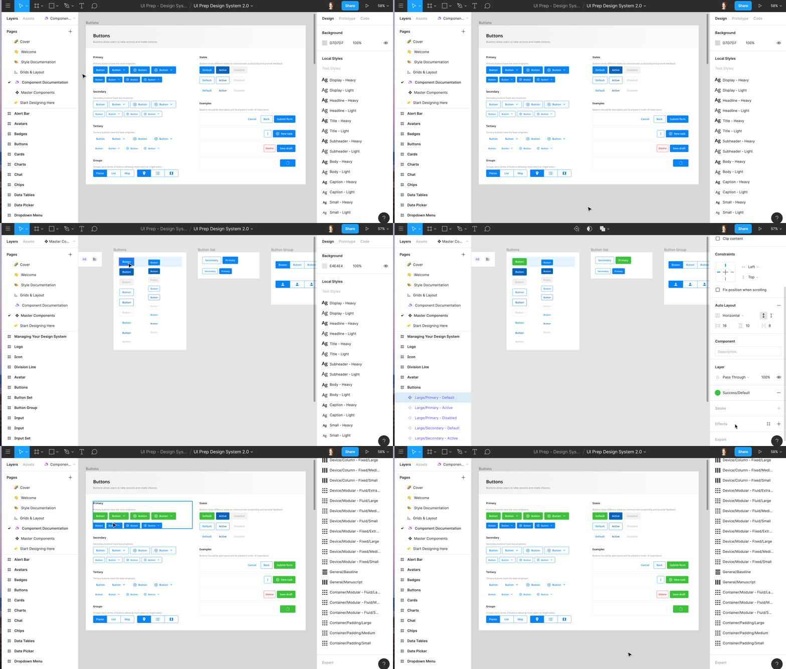
Figma introduced the concept of components, but Adobe has been catching up lately, as they’ve also introduced them in XD. Components are similar to symbols, the UI elements that can be reused across designs, but they are a bit more flexible. From components, you can make “instances”, which allow you to edit their color, text, stroke, etc while keeping them linked to the original component. It’s helpful when you want to re-use UI elements and it eases the design flow. Both Figma and XD allow you to add your components to your libraries, where you or your team can use them.
Cost
Both Figma and Adobe XD are free in the “starter” pack form. It’s a little difficult to compare further since both tools come with unique features or packs. For example, Figma’s Team Plan allows you to have unlimited projects, unlimited version history, or shared libraries, features that Adobe XD doesn’t have. On the other side, Adobe XD has separated pricing plans for enterprises and individuals. On this note:
- Figma has 3 options: free, professional ($12 or $15 / month for each team member), and organization ($45 / month for each team member).
- XD has 2 options: for individual use, it goes from free to $9.99 / month and for businesses, it’s $22.99 / month.
It depends on your needs here. If you are already part of the Adobe universe, XD’s pricing plans are reasonable. Give the free one a try and see if it fits you. Also, since Figma is also free at first, you can test it out as well. See which one meets your requirements and make that your go-to tool.
Plugins
Plugins let you add extra functionalities to the tools. They can serve as little power-ups that boost a designer’s workflow. I have to admit, after playing with both tools for a while, they are pretty powerful when it comes to plugins. But they are still unique:
- Figma added plugins to their platform a short time ago. There are many available here as well, but what’s amazing at Figma’s plugins is that you can create your own. And, if you have the organization pricing plan, you can create your private Figma plugins for your team. That’s pretty cool.
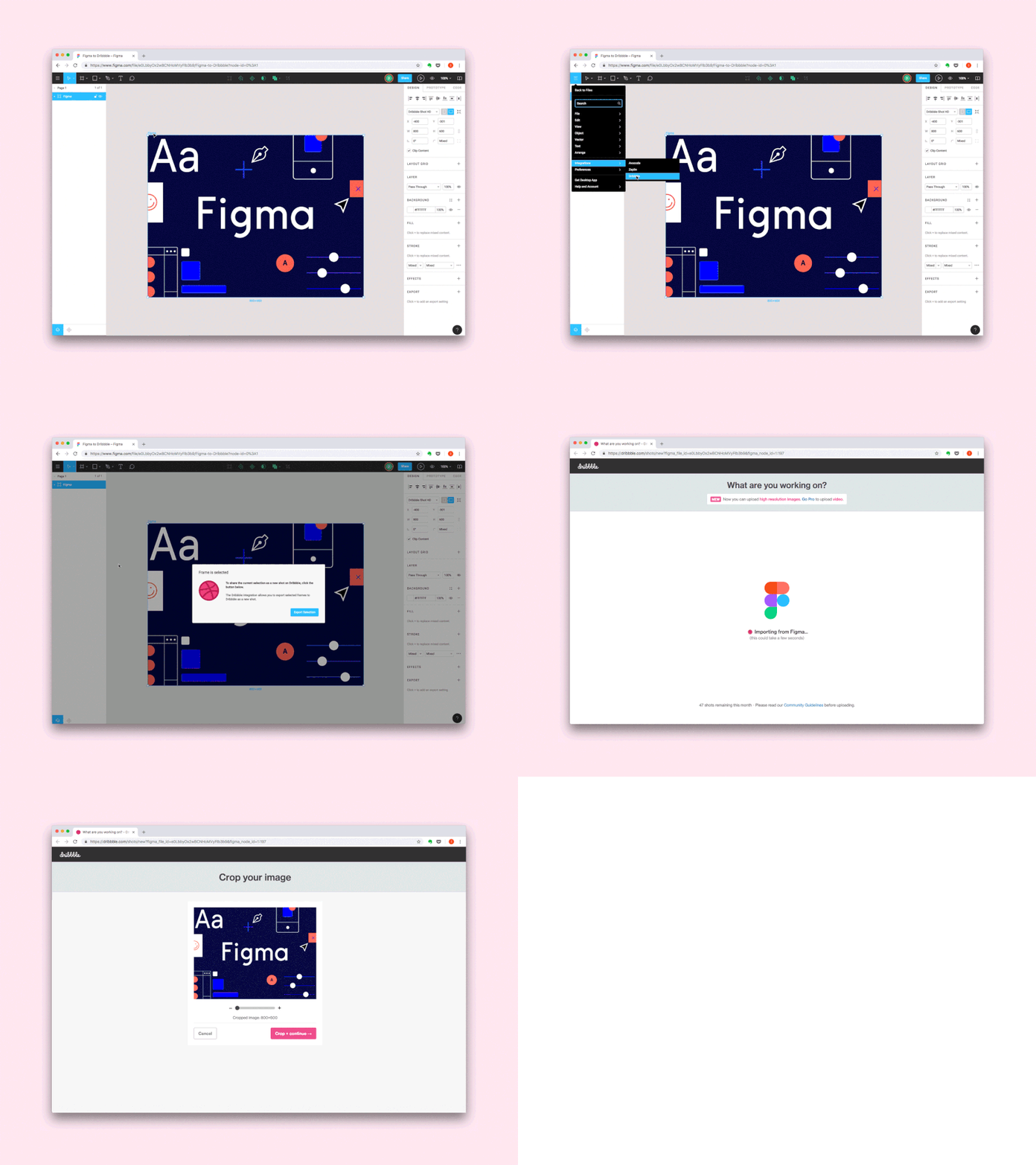
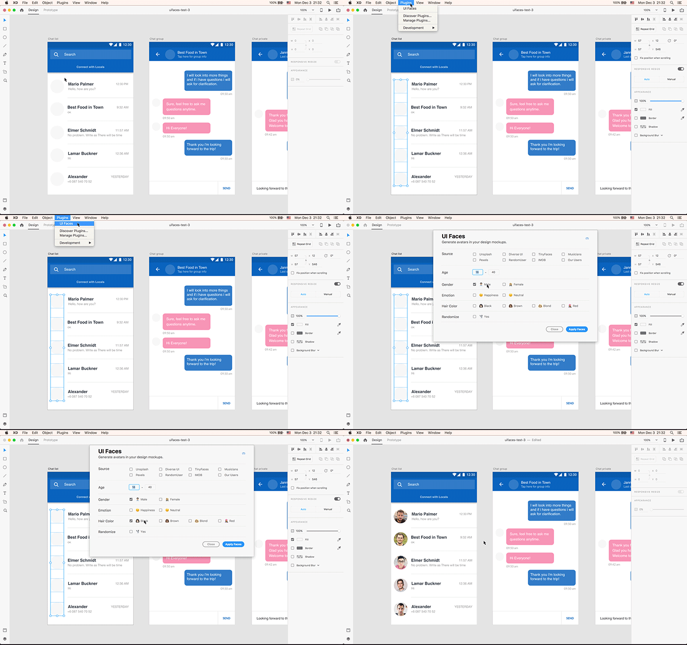
- XD has a wide range of plugins available. From Google Sheets data to the integration with Dribbble, Trello, UI Faces, and so on, you have lots of plugins to choose from. The possibilities are pretty much endless. XD is doing their best to make sure they cover all the needed areas here.
Prototyping
Through prototyping, you can see how you can interact with the developed product, what are its features, what will it look like, and so on. In this stage, you can rely on anything from sketches, to wireframes or mockups to provide a more clear prototyping experience. Here, Figma and XD provide similar features. While using them and during my research, I couldn’t notice any differences. I know there were some in the past, but in my opinion, both tools are kinda at the same level at this moment. If you spotted any difference, let me know in the comments!
Resource Management
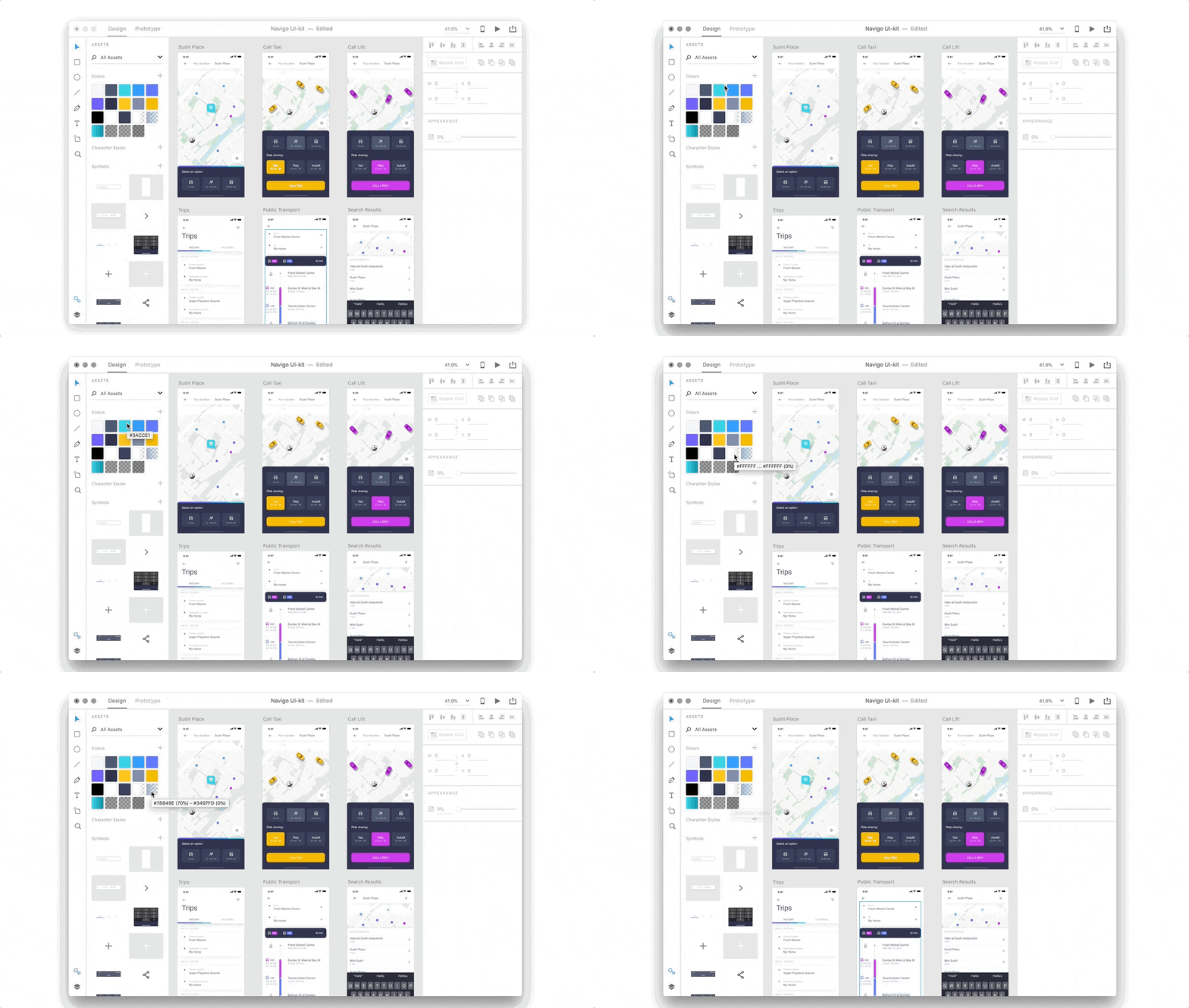
Last, but not least, let’s see how the tools help you manage your assets. From colors to text styles, editing styles, symbols, etc, both allow you to add them to an assets panel and reuse them throughout your project. The only difference is that
- Figma lets you sync all of your resources anytime and anywhere
- XD you can only use your resources in one project, or through the Creative Cloud library. The thing is that you can’t sync your assets from XD to your CC. Thus, you can’t use your resources across more projects. There is a hack to that, you can copy-paste your assets from one project to another and voila! But that is a bit more time consuming than Figma’s option.
Final thoughts
When I started this post, I had no idea I will be doing this much research. I’m glad to see that XD and Figma are evolving. I truly believe they are great tools that resonate with different kinds of folks and needs. While working for Evozon’s internal project Movium, choosing Figma felt like the right thing as the focus was on collaboration. But if I were in my first days of designing, I’d give both a try. This way, you’ll know which one fits better to your working style. And, if destiny will have you working with the other one, you will already have some experience with it.
If you want to improve your skills in these tools, check out their tutorials on Youtube. Both Figma and Adobe XD have useful resources on their channels. Also, I love checking up on these guys at UX Collective. And, whenever I look for inspiration, you can usually find me on Dribbble. As I want to keep on sharing cool UX resources, you can also check out the guys at UX Planet. This 52weeksofUX thing is also pretty cool. If you have other cool UX resources, share them in the comments! Let’s make a UX library filled with helpful resources together.
