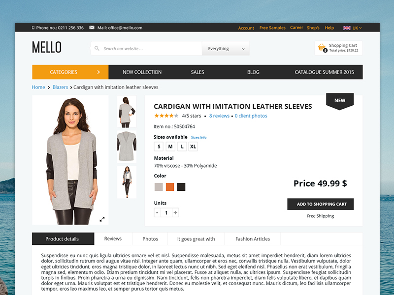
The product page is the critical point in the Conversion Funnel (sequence of steps that transform a visitor into a customer and can be easily viewed using Google Analytics). This page influences the visitor’s decision to either add a product to the cart, or to quit the acquisition.
The treatment of the following essential elements plays a particularly important role in the mentioned process:
Loading speed
This aspect has a major impact in the purchasing decision. A slow page especially influences the website’s dropout rate or bounce rate. According to gomez.com and akamai.com the delay of 1 second in page load generates a decreased by 7% in the conversion rate. Therefore, this aspect should not be neglected at all.
Product images and videos
Because our brain is inherently better at processing images than other content, the user notices these elements as the first detail upon entering this page. Images and videos are therefore the easiest option to substitute the lack of interaction with the product that a shopper might experience in a physical store. The quality of the images/videos holds particular significance, especially for products with lesser-known attributes (e.g., a new clothing brand, a product explained through photos and/or videos to clarify its features).
Product description
A complete description of the product can make the visitor understand the reasons for which the product fits his/her needs. It also helps to understand the product attributes (e.g., describing the materials used in clothing manufacturing, explaining the production of specific foods, etc.). Along with product photos, descriptions have the ability to help the client imagine using the product.
Reviews, user generated content
These elements play a very important role because buyers seek social approval and evidence (“social proofs”) to receive confirmation that the product is used and there are many people happy with it. In this way, customers confirm the value of the product, enabling decisions to be based on the vote of confidence from other users.
Price and quality
The potential client should be clearly informed what is the total amount he/she will pay for a product. When it comes to products available in a variety of quantities / weights it is necessary to specify the exact amount for the quantity / grammage selected.
Delivery and costs, Return policy
The unexpected costs appearing on the checkout page, after buyers have set cost expectations, significantly affect the conversion rate. They tend to decrease it and potentially redirect users to competitors who communicate their policies transparently from the outset.
Call to Action
It’s an element that must be compulsorily included in order to guide the visitor to the next step, the purchase of the product. In its absence or lack of visibility the user does not spend too much time to find the next steps. Therefore, the chances of leaving the store will increase exponentially.
Contact information
Must be visible. It ensures that users are aware they can contact you at any time. This assurance is vital, as it gives them the confidence that they have the necessary support from the store. This support is available not only during the order placement process but also in the subsequent stages.
Trusted badges
Helps the user make purchasing decisions faster because they are given the certainty that the shop is one that has received confirmation from the authorities in the field. They increase the level of trust in the security of payment, if paying by card. And help users realize that the store has received a degree of testimonies over time. Among the most popular badges are Norton, McAfee, BBB and in Romania the logo of Trusted.
Compare functionality
A user research aprox.16 minute before making a purchasing decision. Thus, the user needs a simple way of reading the information about the desired products. Your shop can mimic this behavior, that users have in physical stores of looking through the shelves and evaluating their options, by offering the option to compare 2-4 products at the same time.
In conclusion, respecting as many of these recommendations as possible will increase the chances of a larger number of visitors passing this point in the Conversion Funnel. As a result, they become one step closer to the ultimate goal of finalizing a purchase.
Article written by Roxana Stan


